

Never Miss a Beat: Get a snapshot of the issues affecting the IT industry straight to your inbox.
Twitter tests a redesign of user profiles that borrows heavily from Facebook, Google+, and Pinterest. Here's why we hope Twitter reconsiders it.
4 Min Read
<em>Image via Mashable</em>
If imitation is a form of flattery, Facebook, Google+, and Pinterest should be charmed by a drastic redesign that Twitter is reportedly testing.
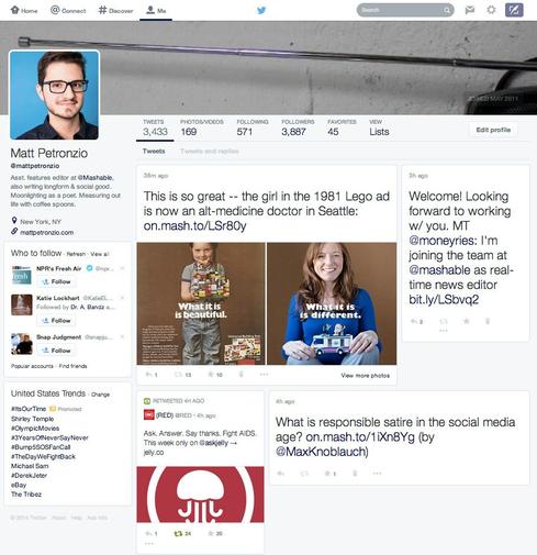
The new profile page features an extended cover photo with tabs below it to view the user's tweets, photos, and videos; accounts they follow and their followers; favorite tweets; and lists. The user's profile picture is moved to a new left-hand column; below it are the user's bio, location, suggested followers, and trending topics.
Most notable is a change in the user's personal tweet stream. Tweets are no longer displayed chronologically; instead, they're arranged in a mosaic, similar to Google+ and Pinterest. The homepage remains relatively unchanged, though some tweets are displayed larger than others, possibly indicating that -- like Facebook -- tweets with higher levels of engagement will be shown more prominently.
Last month, Twitter launched a redesign of the site's homepage that more closely resembles its mobile app. It's unknown how many users have the new design Twitter is testing or whether the company plans to roll it out more broadly. We hope it doesn't; here's why.
Goodbye variety
Pinterest and Google+ look alike. Google+ and Facebook once looked alike. With Twitter's proposed redesign borrowing design concepts from Facebook, there's little variety among the most popular social networks.
Unlike Facebook, Twitter's product and design have changed very little over the last eight years. Tweets are still capped at 140 characters and are displayed in a stream. Twitter hasn't faced the backlash that Facebook is accustomed to after major changes because users know exactly what they'll see when they log on. There's a certain comfort in knowing that Twitter's design is unique, and that it won't strayed far from it.
Facebook's design has become the gold standard for some social networks and many social business platforms, but it's unnecessary for Twitter to follow suit. We don't need all of our social networks to look the same. Twitter's concept has always been simple, which is why it deserves the simple, straightforward design we're all used to. Not every social network needs to be Facebook -- variety in design, features, and product help distinguish one social network from another. Change can be good, but sometimes it's unnecessary.
[Facebook has suffered some strikeouts during its 10 years. Read more: 10 Famous Facebook Flops.]
Goodbye chronology
Twitter's new profile design borrows heavily from Google+ and Pinterest. While the new look favors rich media with larger photos, deemphasizing the chronology of posts makes it feel overwhelming and cluttered.
When Facebook first redesigned its Timeline, it abandoned its display of sequential posts by breaking users' profiles into two columns. Users never grew accustomed to it, and ultimately the social network ditched it for its traditional one-column view.
Google+, on the other hand, rolled out a redesign last year that absolved it of Facebook comparisons, borrowing instead from Pinterest. If Twitter's redesign does launch more broadly, it will be interesting to see which path its users take: resistance a la Facebook, or acceptance a la Google+.
Goodbye control
If there's one thing many Facebook users lament, it's the power that algorithms have over their accounts -- in particular, the ones that determine which stories they do and don't see in their news feeds. The changes Twitter is testing likely incorporate similar algorithms.
Which posts are seen at the top of a user's profile, and which ones are shown further down? While Twitter has not commented on any of the redesign's potential elements, the popularity of your posts --how many people have favorited, replied to, and retweeted them -- could determine which tweets appear where. The same goes for users' homepages. Presumably, more popular posts will be displayed more prominently.
What do you think about the changes Twitter is testing?
InformationWeek 500 companies take a practical view of even trendy tech such as cloud, big data analytics, and mobile. Read all about what they're doing in our big new special issue. Also in the InformationWeek 500 issue: A ranking of our top 250 winners, profiles of the top five companies, and 20 great ideas that you can steal. (Free registration required.)
About the Author(s)
You May Also Like
More Insights
Editor's Choice


May 2, 2024
While there are plentiful options in cyber resiliency and business continuity tools and platforms, there isn’t one that can knock out everything from sudden cloud outages to prolonged ransomware attacks in a single punch. What can you do to keep the company on its feet no matter what is thrown at it? Find out in this new virtual event.
Reserve Your Seat Now