

Never Miss a Beat: Get a snapshot of the issues affecting the IT industry straight to your inbox.
When it comes to data presentation, graphical glitz can confuse rather than clarify what's being communicated. Our practical series delves into common errors and how to correct them.
10 Min Read

I'm going to take you on a short stream-of-consciousness tour through a few of the most common and sometimes downright amusing problems that I see in my work as a data presentation consultant. This article is the second of a five-part series on the fundamentals of effective data presentation. If you produce reports that present data or manage people who do, these articles will offer you practical and clear advice.
To make meaningful judgments about data presentation practices that don't work, we must start with clear principles about the purpose of data presentation and what identifies it when it does work. It really all boils down to one thing: communication. Any presentation of data that you prepare — whether in the form of tables or graphs or in some combination like a dashboard — is only successful to the degree that it communicates to your target audience what you intend for it to communicate. Did your message get through? Was the data understood, accurately and efficiently? It's all about the data. As the renowned expert in the visual display of information, Edward Tufte, so simply yet eloquently put it: "Above all else show the data." Having established communication as the desired outcome, any data presentation practice that doesn't communicate effectively is a problem. Now let's start our tour.
Start with a Clear Message
If we begin our tour at the very inception of the data presentation process — the point when someone first begins to determine what to present and how — the first common mistake is complete ignorance of the message that ought to be communicated. Before you can determine how to effectively present a message you must first know what the message is. It isn't enough to know that the message is about sales. What is it about sales that you've discovered in the data and wish to pass on to others? Have you discovered that sales as a measure of revenue in U.S. dollars have steadily declined in the last three months? Have you found that, even though sales have steadily increased year to date, you are well below your plan for the year? Have you noticed that the only reason that sales are on target for the year is because one particular salesperson in Asia is burning up the market?
Before you decide how to present the data, step back for a moment and think carefully about what you want to say. Actually put it into one or more sentences that are as complete and meaningful as necessary to communicate what your audience needs to understand. This isn't a silly ritual. You can find clues in the words you use to express your message that will direct you to present data in a particular way. For example: "Even though we're five percent ahead of our year-to-date revenue plan, four of our five products have been steadily declining in sales since the beginning of the year. That we're ahead of plan is entirely due to the success of a single product: yet 80 percent of the sales force is dedicated to the four products that are declining." This is interesting information that certainly deserves a response. If you created a graph that displayed overall year-to-date revenue compared to plan, this message would be lost. The fact that the message concerns (1) changing sales through time, (2) a contrast between the four declining products and the one increasing product, and (3) a dominant allocation of sales resources to products that are failing are all important points that determine how the data ought to be presented.
To communicate this message effectively, you still have to know about effective graph design, but you haven't got a chance of doing it right if you don't begin with a clear understanding of your message.
Don't Insist on a Graph
If you can communicate your message clearly, efficiently, and with the desired impact in a simple sentence, that's what you ought to do. If your message requires the precision of a table of numbers and text labels to identify what they are, that's what you ought to use. It's a mistake to force your audience to use visual perception to interpret a graph, struggling to figure out the exact values of the data encoded as bars or lines when the message has nothing to do with the shape of the data. Yes, some people are more impressed with graphs even when they're a poor means of communication, but do you really want to produce bad and just plain stupid work?
Tables work best when the data presentation:
Is used to look up individual values
Is used to compare individual values
Requires precise values
Values involve multiple units of measure.
Graphs work best when the data presentation:
Is used to communicate a message that is contained in the shape of the data
Is used to reveal relationships among many values.
Use the Right Graph Type
Different types of graphs are designed to communicate different types of messages. You can't force a scatter plot to effectively communicate revenue for the last 12 months. You shouldn't force every kind of data into a bar graph just because that's the only kind you've learned to make. You aren't doing anyone any favors by forcing year-to-date sales by region into a radar graph just because it looks cool. Software vendors compete to outdo the competition by providing a cornucopia of graph types; time that would be better used helping their customers to understand and effectively use a smaller, more practical set of graphs.
Figure 1 shows an example on the top taken from Visual Mining's Web site of a graph that's inappropriate for the message, compared to one that I made on the bottom to illustrate a more appropriate choice.
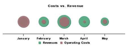
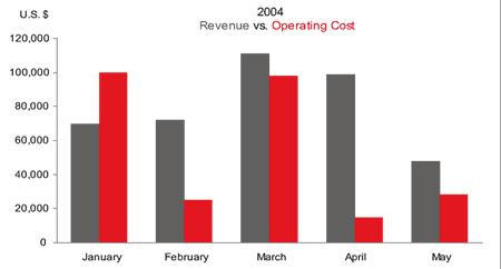
FIGURE 1 Poor graph choice on the top vs. an effective choice on the bottom.
This example is somewhat extreme, but not any more absurd than countless graphs that I've seen in actual use. A more common example is the use of lines to encode data in a graph when bars would be more appropriate. The graph on the top in Figure 2 uses a line to encode the expenses of seven departments. Why is it more appropriate to use bars to encode this data, as I've done in the graph on the bottom?
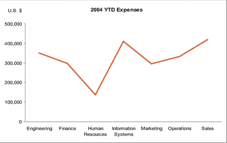
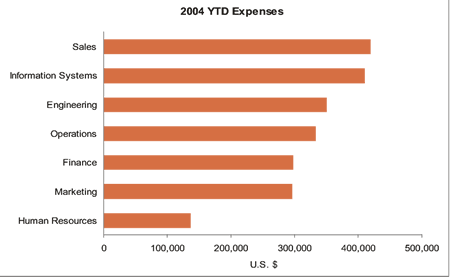
FIGURE 2 The graph on the top illustrates an inappropriate use of lines to encode data, which is better encoded using bars, shown on the bottom.
Look at the slope of the line: As it moves from data point to data point in the graph, it suggests change between different instances of the same measure. The difference between each department's expenses is meaningful, but the movement from one department's expenses to the next doesn't represent a change. Bars would be a more appropriate choice to emphasize the independent nature of each department's expenses, as shown on the bottom. In contrast, it's very appropriate to use a line to encode the flow of values across time, such as consecutive months of a year. The movement from one value to the next in this case does represent change, so the slope of the line is meaningful: the steeper the slope, the more dramatic the change. Even when graphing time-series data, however, if you want your message to emphasize the comparison of values within each time period (for example, the comparison of revenue and operating expenses in each month in Figure 1), rather than how those values change through time — bars highlight this information more effectively.
The last article in this series will examine the most common types of messages that require business graphs, along with the best types of graphs for each of these messages.
Express and Explain
Too often, data presentations try to impress rather than express — and entertain when they should explain. When you don't know what you're saying, you can always hide the fact by dressing up the presentation in flash and dazzle. Generally, data presentations filled with meaningless fluff result less from not knowing what to say than from not knowing how to say it. Software that produces business graphs makes it far too easy to decorate your message with distracting visual content. Tufte calls this "chartjunk" — visual content that provides no real information and is therefore distracting and sometimes downright misleading. The most common example of chartjunk is the inclusion of grid lines in graphs — often, grid lines that are dark and heavy. Grid lines are rarely useful, and prominent grid lines are especially distracting. The purpose of a graph is not to provide a means to interpret the precise value of each bar, line, or data point. Instead, the purpose is to see the shape of the data, and from that shape discern meaningful patterns, such as trends and exceptions.
Take a look at the top graph in Figure 3. It was taken from the November 24, 2003 issue of Newsweek. Notice how the cute images, the abundant text throughout the graph, and even the background gets in the way of seeing the shape of the data and discerning its message. Now look at the alternative that I've provided on the bottom, where the fluff has been removed and the presentation has been designed to directly and clearly support the message.
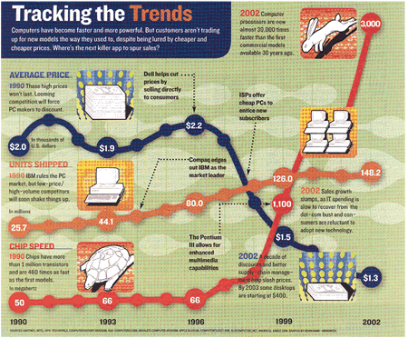
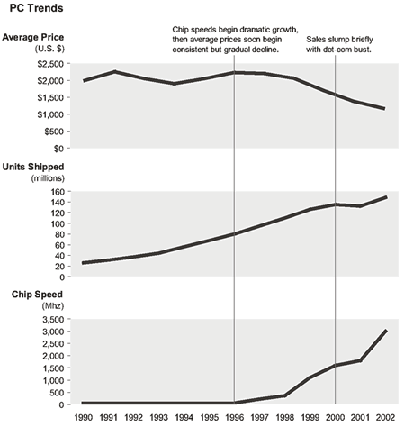
FIGURE 4 Example of chartjunk in the graph on the top vs. the same data minus the fluff on the bottom.
When designing business graphs, more is definitely not better, unless the more is meaningful data that supports the message. The author Antoine de St. Exupery once wrote: "In anything at all, perfection is finally attained not when there is no longer anything to add, but when there is no longer anything to take away." These are wise words of a great communicator. In the third installment of this series, I'll examine a sequence of design steps that will help you remove all distractions from the message and then make sure that the most important parts of the message stand out above all else.
Know, Don't Guess
Effective graph design isn't always an intuitive process. When you create a graph, you design something that communicates through visual perception. Knowing something about how we perceive and interpret visual stimuli — objects made visible through light, possessing a particular combination of attributes such as color, size, and location in space — is a necessary conceptual foundation to effective graph design. Which visual attributes can reliably encode quantitative data? Which visual attributes can be used to make some things stand out above others? Which colors work well together? What are the limits of short-term memory, and how do limits apply to graph design? Why is it difficult to accurately compare the sizes of the slices in a pie chart?
Many years of solid scientific research have provided answers to these questions and many more that are relevant to graph design. You don't need to be a scientist yourself to become familiar with these concepts and how they can be used to present data effectively.
The common mistakes that I've touched on in this article are only a sampling of a much larger list. You can probably identify many more without straining your brain in the least. My purpose, within the constrained space of this article, is simply to get you thinking about the importance of effective data presentation and noticing how some of your own design practices might need improvement. Stick with me through the three remaining articles in this series to continue honing your skills in effective data presentation.
Stephen Few [[email protected]] is the founder of Perceptual Edge, a consulting firm that specializes in information design for analysis and communication. His new book, Show Me the Numbers: Designing Tables and Graphs to Enlighten, is now available from Analytics Press.
Resources
Tufte, E. R., The Visual Display of Quantitative Information, Graphics Press, 1983.
"The Information Cannot Speak for Itself," July 10, 2004.
About the Author(s)
You May Also Like
More Insights
Editor's Choice


May 2, 2024
While there are plentiful options in cyber resiliency and business continuity tools and platforms, there isn’t one that can knock out everything from sudden cloud outages to prolonged ransomware attacks in a single punch. What can you do to keep the company on its feet no matter what is thrown at it? Find out in this new virtual event.
Reserve Your Seat Now