Reporting used to be boring, but no more. Our BI Scorecard series takes a comparative look at reporting features.

For notes on evaluation methodology and selection of products to evaluate, please see Part 1.
Reporting has a reputation for being, frankly, boring. The reams of uninspiring paper once spewed from mainframe printers created so much raw data that they were rarely useable for decision-making. Staring at a piece of paper rarely leads to action. Analysis, conversely, leads to action — which is what most report consumers strive for.
The good news is that reports are changing. Just as cars went from purely utilitarian machines to icons of luxury and brilliant engineering, so today's reports enable swifter, more competitive action.
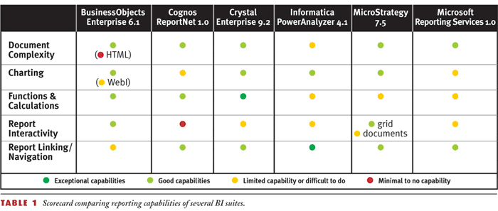
In the first segment of this BI Scorecard product review series, I looked at query features of major BI tools — the core functionality that lets you get the data out of your data warehouse or source systems. (See Resources.) In this second segment, I will examine reporting features of the same six major BI products — features that transform a plain result set into a highly formatted document that more readily helps you identify trends, exceptions, and thus business opportunities. Table 1 scores key reporting features.

Production and Management Reports Merge
Historically, reporting has been broken into two market segments: management reporting for internal decision-making and production reporting to generate operational documents such as invoices, bank statements, or statutory documents.
However, as BI technology has matured with user needs, vendors are moving to offer both capabilities in an integrated toolset. Take, for example, a production report consumer who gets an unusually high energy invoice; the consumer immediately wants to analyze it — to compare it to the last month's invoice. Even better, the energy provider should add a nice trend chart on the invoice that graphically displays changes in power consumption.
In the past, activities like drilling into last month's invoice details and charting were capabilities largely reserved for management reporting. So in 2003, vendors that historically focused on management reporting have moved into the production reporting space through acquisitions and new product launches that emphasize how these capabilities shouldn't require separate tools.
Document Complexity
With expanded user expectations comes the need for reporting tools to support complex documents, enabling you to take raw query data and present it in multiple ways within one page or report. For example, you may want to see detailed tabular data of open orders alongside a pie chart that shows percentage of open, late, or on-time shipments. However, if you are designing an invoice, you don't want a table at all. Instead you want to control where individual components appear on a page. Whether or not to use banded reporting to control report layout is something vendors have argued a lot about recently. Their differences are about the "how," not the "what." From a user perspective, all you care about is whether or not you can have groupings, subtotals, and details. However, the products differ in how they achieve this objective.
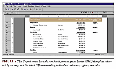
Some, such as Crystal Reports and MicroStrategy Report Services, use banded reports, requiring you to put subtotals in a header or footer section and details in the body. Charts must also appear in header or footer sections.
Figure 1 shows a sample of a Crystal banded report in which there is a subtotal row for each country and detailed rows for individual customers. The "GH1" on the left of the screen refers to Group Header 1, a band. Each report can have multiple groupings or levels of subtotals.

Others BI products, such as BusinessObjects Enterprise (the BusinessObjects desktop product plus WebIntelligence), Cognos ReportNet, and Microsoft Reporting Services, use a page design concept that lets you put the totals and details wherever you want; they are just individual objects whose position you freely control. A summary-level chart can appear anywhere on the page you want.
The results of the two methods can be quite similar to each other, but the design processes are drastically different. A banded report structure may be more familiar to legacy mainframe report developers, whereas the page design concept will be more familiar to Excel, PowerPoint, or HTML developers. As I discussed in last issue's Query segment, whether or not these multiple tables and charts can be populated from different data sources and queries is another capability in which the tools differ.
 Informatica PowerAnalyzer is the only vendor I reviewed that doesn't yet provide complex reports. It continues to focus on management reporting and not production reporting. PowerAnalyzer allows only a toggle between a single table view and chart view; users have little control over where these objects appear on a page or screen. Until recently, MicroStrategy had similar limitations, which it removed with the launch of Report Services in December 2003. While BusinessObjects desktop documents and WebIntelligence documents created via the applet interface can be quite robust, documents created with the zero-footprint HTML interface can contain only one block type (that is, one table or one chart).
Charting
A chart is worth a thousand words. Unfortunately, many report developers still start with the traditional tabular data set where a chart would best facilitate analysis.
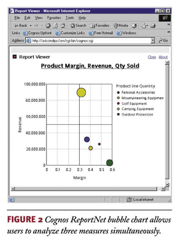
All the vendors offer the same basic chart types (bar, line, and pie). However, only a few offer unique chart types such as map, gauge histogram, and bubble (shown in Figure 2). Within the chart types, users need the ability to control various chart aspects such as min/max scale, label placement, 3D effect, and colors of individual lines and bars.
The ability to have dual Y-axes is a key requirement when you're charting multiple measures. For example, if you analyze the effect of price on quantity sold over time, you must have two Y-axes. Business Objects provides this capability in the desktop tool but not in WebIntelligence. Cognos had this limitation in Impromptu and Cognos Query but corrected it with ReportNet. Microsoft Reporting Services does not currently support dual Y-axes. When your report has multiple groupings or sections, another charting capability to consider is whether you can have multiple charts for each group. If yes, then the Y-axis scale should automatically readjust to the subset of data.
Report Interactivity
The degree to which a report consumer — the typical business user — can interact with a report is one of the most important reporting criteria. Failure to provide interactive reports is merely to automate the process of distributing "dumb" paper reports. Seeing an exception in a trend chart may be the first step to business insight, but being able to investigate that exception is the critical second step.
Even if the BI tool provides a degree of interactivity, some deployments limit it. Savvier users will automatically export the data to Excel, creating multiple versions of the truth, a more dangerous situation now with the Sarbanes-Oxley Act.
Interactivity has two aspects: individual report interactivity and navigation across multiple reports. In both cases, the line between a report and OLAP drill-down is becoming increasingly blurred.
For long reports, a collapsible table of contents that displays the major groupings and subtotals is a must-have. For BI tools that have an embedded OLAP engine, expanding that subtotal may be a drill against a cube or it may be the equivalent of expanding an outline view. Alternatively, the drill-down may open another report, a capability I refer to as navigation. From a report consumer perspective, the effects are similar. Conceptually, however, the report design processes are drastically different, as is the effect on the network, back-end database, and maintenance. A simple FIND command is useful for searching for individual order numbers, products, or customer names within a report. Ideally, report consumers should be able to re-sort and filter data without having to edit the report or launch another query.
Business Objects' WebIntelligence offers the best individual report interactivity. Microsoft Reporting Services offers a unique outline view that simulates drilling; however, it lacks filtering and sorting. In the past, MicroStrategy has also been strong in interactivity, however the new Report Services with formatted documents can't automatically leverage the interactivity capabilities of its traditional grid view. Developers must instead manually define links to the traditional grid view, similar to a report-to-report navigation.
Cognos ReportNet is weak in individual report interactivity, providing users with a static page only. In version 1.1, ReportNet will include a table of contents feature that a developer must explicitly add; it does not automatically read the underlying groupings used for subtotals. However, ReportNet offers good overall navigation allowing drilling from report to report as well as to other applications, including Cognos's PowerPlay and Visualizer. The navigation features within Informatica PowerAnalyzer are quite unique. Rather than drilling from one report to another, PowerAnalyzer uses the concept of "workflows." Users see a list of reports to choose from rather than only being able to choose from one static subreport. One main report can have multiple workflows, offering much more navigation flexibility. Individual report interactivity is a bit cumbersome and lacks a FIND and outline view.
Formulas and Functions
In an ideal world, data warehouse data modelers would precisely predict every calculation and transformation end users want. These would be defined in the database to ensure maximum reuse and efficient processing. In reality, a lot of the intelligence occurs in the report, and if you are accessing an OLTP system, it has to. When evaluating BI tools, keep in mind there are three places that formulas and functions may be used: in the metadata layer, the query, or the report. Because these formulas can be defined in different places, who defines them (an administrator versus a user) and how they get processed also differ. Ideally, a BI tool will provide a full function set in all three places, but, unfortunately, few do.
Business Objects enables different sets of functions for its "universe" (metadata), query, and report-based calculations.
Cognos ReportNet uses one set of functions for all three possible calculation locations.
Informatica shows its ETL roots in that it currently expects most calculations to be done as part of the ETL process. Within the reporting tool, Informatica is limited primarily to simple aggregate calculations such as sum, average, and count — although there is standard deviation and if-then-else logic. Informatica plans to provide 200+ functions in a mid-year release.
MicroStrategy is limited this way as well, particularly in the Web product. Desktop users can create more metrics but only project administrators can define new attributes.
Other Considerations
Document complexity, charting, interactivity, and formulas and functions are just a few of the report features that differ among major BI vendors. Other aspects such as conditional formatting, relative positioning, and style sheets are additional reporting features that affect report design.
More to Come
In the next issue, I'll look at information delivery capabilities — features that determine how these powerful documents reach end users.
Cindi Howson [[email protected]] is the president of ASK, a BI consultancy. She coteaches The Data Warehouse Institute's "Evaluating BI Toolsets" and is the author of Business Objects: The Complete Reference (McGraw-Hill Osborne Media, 2003).
Resources
Part 1: Query Capabilities - March 20, 2004
Part 3: Information Delivery - April 17, 2004
Part 4: Excel Intration - May 1, 2004
Part 5: OLAP - May 15, 2004
Part 6: Administration - June 1, 2004
Part 7: The Best BI Tool - June 12, 2004
About the Author(s)
You May Also Like


