

Never Miss a Beat: Get a snapshot of the issues affecting the IT industry straight to your inbox.
EPA's plain-language app on waterways pollution cited as example of innovative information tools from government.
5 Min Read
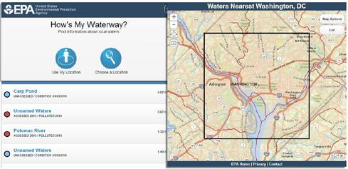
<b>How's My Waterway? app allows consumers to find <br />reports on the health of local waterways.</b>

6 Cool Apps From Uncle Sam
6 Cool Apps From Uncle Sam (Click image for larger view and slideshow.)
Due to industrial spills in West Virginia and North Carolina and the ongoing drought in California, the issue of local water quality is on a lot of people's minds these days. The Environmental Protection Agency's How's My Waterway? app can let you find the answer at the click of a mouse or a tap on a smartphone.
The app, which the EPA introduced in honor of the 40th anniversary of the Clean Water Act in late 2012, was honored Feb. 6 as one of the most innovative information applications to come out of the public sector over the past year.
"This was something there was a clear audience for and we were quite interested" in providing, said Douglas Norton, senior environmental scientist in the agency's Office of Water, who served as the project manager. The app is part of EPA's Water Data Project, a broader effort "oriented towards trying to help make scientific information that is public, but not easily understandable, more useful to a broader audience."
[Overcoming the barriers of innovation isn't easy. Read: Federal CIO: Don't Let 'Sunk Costs' Deter Innovation.]
The app draws upon biannual reports sent in by the states. EPA consolidates the states' information and files a report for Congress, Norton said. The app's goal was to provide the same information to the public, but in plain English. The EPA's consumer-friendly tool on local water safety, applicable almost everywhere in the nation and using existing data, earned it a top prize from ACT-IAC, a public-private partnership, which honored 30 innovative information tools developed for the public sector.
"One of the things... we all face, with tight budgets and concerns about expense, was not to create something that needed new data but made the most out of the data we already had," Norton said. Creating the app only required drawing on existing data and GIS information, current agency services, plus a little programming time by the contractors who already support EPA's other web services.
The site is platform-neutral, Norton said. "What we have here is essentially a website put together through responsive design... So far as we know, it works on any of the mobile devices we're aware of."
Norton said that at the most granular level there are 600 or 700 categories of pollutants, far more than most citizens are looking for. The app uses about 34 broader categories of types of water pollution, such as metals. When a user defines the geographic area he or she is interested in, a map shows all the waterways in that area.
Clicking on a specific river or stream brings up a menu of reports, pollution categories, any cleanup plans, and contact information for that state's water quality programs. If the user wants greater detail, he or she can click on the databases from which the broader information is summarized.
The app uses the most recent state-filed assessments, which may be dated or incomplete, he said. Some states use volunteer monitors that follow proper scientific methods for assessing water quality, but How's My Waterway? is not a crowdsourced app. Because the data must be geospatially coded, it can take six years or more for some states to file all their data, he added. So it could take years for the impact of the West Virginia chemical spill and the North Carolina coal ash spill to show up in the app.
Barring such extreme incidents, though, it normally takes waterways a long time to get polluted and a long time to get cleaned up, Norton said, so the information has a fairly long shelf life.
The app continues to evolve. Norton said EPA is expanding to include additional forms of water information that are not restricted to the state reports. "We're adding links to other information [such as] beaches, drinking water quality, where groups are unifying around fish restoration," he said. "We've certainly got some recognition that this is a good way to be transparent about resources, the information available, and what's being done about it."
What really distinguishes How's My Waterway? from many other government apps is the plain-language description for the categories it tracks. "We write out a standard [explanation] that starts with the most basic definition of what's involved," Norton said. "People in beta testing were very interested in what individuals can do about this."
User feedback has been both positive and helpful. "One of the things we hear from our users is that they always seem to learn something that they didn't know beforehand by using this tool. Oftentimes it comes from the map," he said. "You go to the map and just drag your way across, [and] you can just get a sense of the waters that are assessed or unassessed, polluted or healthy, and get a sense of how they change as you go across large areas.
"That's a picture worth a thousand words, even if the words are in plain English."
Can the trendy tech strategy of DevOps really bring peace between developers and IT operations -- and deliver faster, more reliable app creation and delivery? Also in the DevOps Challenge issue of InformationWeek: Execs charting digital business strategies can't afford to take Internet connectivity for granted.
About the Author(s)
You May Also Like
More Insights
Editor's Choice


May 2, 2024
While there are plentiful options in cyber resiliency and business continuity tools and platforms, there isn’t one that can knock out everything from sudden cloud outages to prolonged ransomware attacks in a single punch. What can you do to keep the company on its feet no matter what is thrown at it? Find out in this new virtual event.
Reserve Your Seat Now