

Never Miss a Beat: Get a snapshot of the issues affecting the IT industry straight to your inbox.
Could you use a visualization lift in your life and work?
4 Min Read
I never thought I'd be that guy who tracks his fitness data. But a few months ago I tapped on the Nike+ app on my iPod Nano and after about a mile I was a running data junkie.
The lure of easy information sucked me in. I now knew -- through a simple app UI and voice prompts -- my average pace per mile, distance, time, and calories burned for every run. How had I spent all those years slogging through my runs unquantified?
Of course, just knowing basic numbers wasn't enough if I wanted to run faster, which is really the point. What got me hooked is how the Nike+ website and mobile app crunch those numbers for me and display them in such a powerful way. To understand the data -- and to really get addicted to the data, enough to change my behavior -- I need to see it.
[Author Phil Simon discusses data viz tools and their power to change business conversations. Read Big Data Is Nothing If Not Visual]
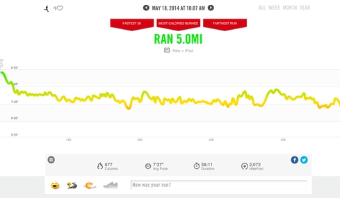
I soon recognized patterns via the Nike+ visual dashboard and activity logs, and I didn't like what I saw. The line graphs showed that during my typical 4-mile runs my pace consistently dropped in the middle miles.
I knew what was going on here, and I'm sure other runners can relate: After a mile or so, I tend to tune out mentally and slow down. It's not that I'm physically tired; my body just switches to autopilot, and it's subtle enough that I never noticed it. But on a data chart, it shows up as a reverse bell curve. Start out high, sag in the middle, finish strong as I smell the finish line.
With these data insights, and the help of voice reminders about time and distance during the runs, I made some adjustments. Being engaged with the data helped me keep up the pace during those dreaded middle miles. It became natural after awhile to simply not allow myself to coast like I used to. I suppose there's something about knowing my data is being tracked that makes me run like I’m being chased.
It only took a few runs to turn the reverse bell curve into something closer to a straight line. I wouldn't say I'm a fast runner now -- more like less slow -- but I did improve as a direct result of understanding the data.

My little fitness Eureka isn't groundbreaking stuff. Lots of people analyze their exercise data using a variety of wearable devices and activity tracking services. But it's a relevant microcosm of how businesses can use data visualization tools in a clear and visceral way – from showing a CEO how customer demographics are shifting to using visual dashboards to track financial data more easily. It makes data analytics seem less intimidating and technical and puts it into the hearts and minds of employees. This is classic consumerization of IT, too: How come I understand so much more about my morning run than I do about the stuff my career hinges on?
Make no mistake, data visualization tools are coming to the enterprise. In InformationWeek's 2014 Analytics, BI & Information Management Survey of 250 IT decision-makers, "Advanced data visualization capabilities" was the technology most respondents were interested in implementing this year.
Additionally, the percentage of respondents with plans to adopt software from Tableau, which focuses solely on data visualization tools, grew by 7 percentage points year-over-year, to 19%, while the percentage of those planning to adopt from traditional players like Oracle, IBM, and SAS fell by 2% to 3% on average.
Data retrieval and analytics remain complex beasts at the enterprise level, as "data scientists" skilled in Hadoop wrestle with a sea of structured and unstructured data sets. But for it to really drive business results, data needs to end up as pictures. Armed with interactive charts, heat maps, and data relationship maps and trees, employees will make better and more confident business decisions.
These better decisions may even become -- like my faster pace during miles 2 and 3 – second nature.
You can use distributed databases without putting your company's crown jewels at risk. Here's how. Also in the Data Scatter issue of InformationWeek: A wild-card team member with a different skill set can help provide an outside perspective that might turn big data into business innovation. (Free registration required.)
About the Author(s)
You May Also Like
More Insights
Editor's Choice


May 2, 2024
While there are plentiful options in cyber resiliency and business continuity tools and platforms, there isn’t one that can knock out everything from sudden cloud outages to prolonged ransomware attacks in a single punch. What can you do to keep the company on its feet no matter what is thrown at it? Find out in this new virtual event.
Reserve Your Seat Now